Trading indicators are great, but nearly all have a common flaw: lag. That’s not to mean trading indicators aren’t relevant, but there’s a more potent trading strategy that doesn’t involve adding thousands of indicators to your chart. That’s where the price action trading strategy comes in. Price action trading strategies encompass every aspect of support and resistance, from candlestick patterns to chart patterns. This will be the main focus of this guide.
Price action is the study of price movement in the market. While it may not be viewed as a trading tool like an indicator, it is the primary data source on which all other tools are based.
What is Price Action Trading?
Price action trading strategies a technique where traders use only the asset’s price and the volume traded to find optimal entry and exit levels. Financial Economics 101: The efficient market hypothesis holds that an asset’s price reflects all the available information in the market. This is in line with the laws of supply and demand. Remember, day trading is a market of buyers and sellers. The more buyers (long traders) in the market, the more bullish the market, and the more sellers (short traders) in the market, the bearish the market.
This effectively means that any asset you trade has already been priced in every relevant data in the market, including volume traded and traders’ sentiment. So, for a price action trader, the trading charts already have all the information needed to develop and execute a trading strategy. Technical indicators are rarely, if ever, used.
The only task then becomes identifying the trigger points – the ideal entry and exit levels.
If you want to trade any price action strategy, you must be able to identify trends and establish the potential support and resistance levels for breakout trading. The backbone of all this revolves around candlestick patterns and chart patterns. We’ll discuss these later on in the guide.
How to Learn Price Action Trading
The basics of price action trading strategies start with understanding the anatomy of the candlestick. From here, you can spot different candlestick patterns and understand their implications.
Understanding the Candlestick
A candlestick has two main parts – the body and the wick (also called the shadow).
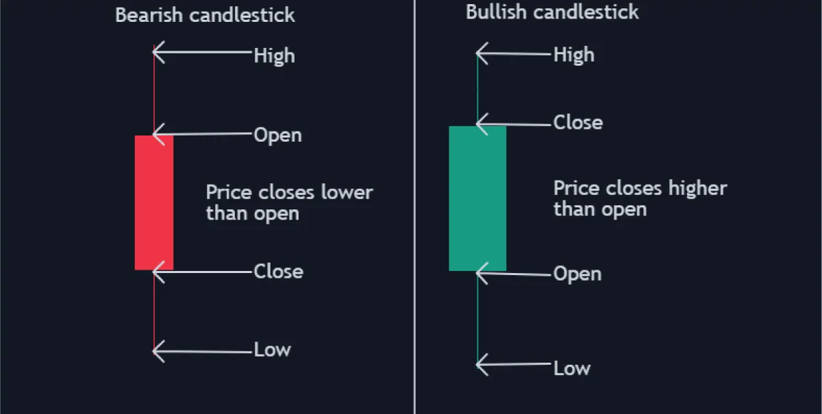
The body of a candlestick shows the asset’s opening, closing, highest, and lowest price reached over a specified timeframe. For example, a one-hour candlestick shows the opening price at the start of the hour and the closing price after an hour. The upper wick shows the highest price reached, and the lower wick shows the lowest price attained during that one hour.
Types of Candlestick Patterns
In price action analysis, a bullish or bearish candlestick with a long body implies a strong bullish or bearish trend. The rule of thumb is to consider a candle’s wick as a region of price rejection. For example, if a bearish candle has a long upper wick, the trend is considered bearish, showing that the sellers dominate the market.
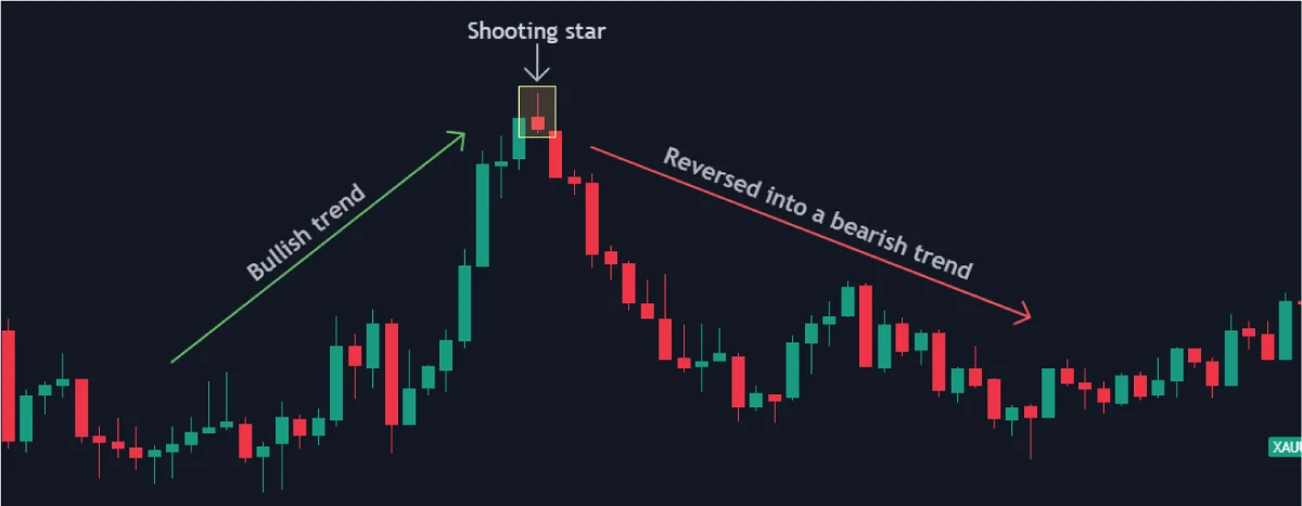
Using this logic in price action analysis, if a bearish candlestick with a long upper wick appeared after a sustained bullish trend, it could indicate a possible trend reversal.
The shooting star is an example of a candlestick with a long upper wick.
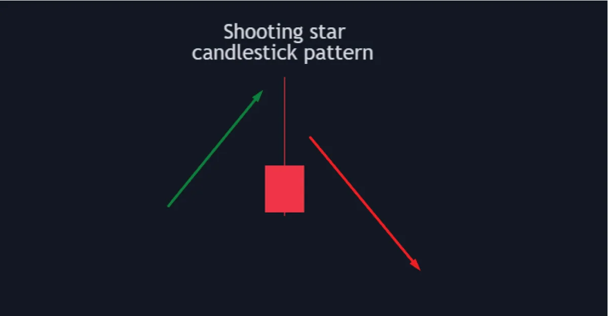
Here’s how it may appear in a price chart.
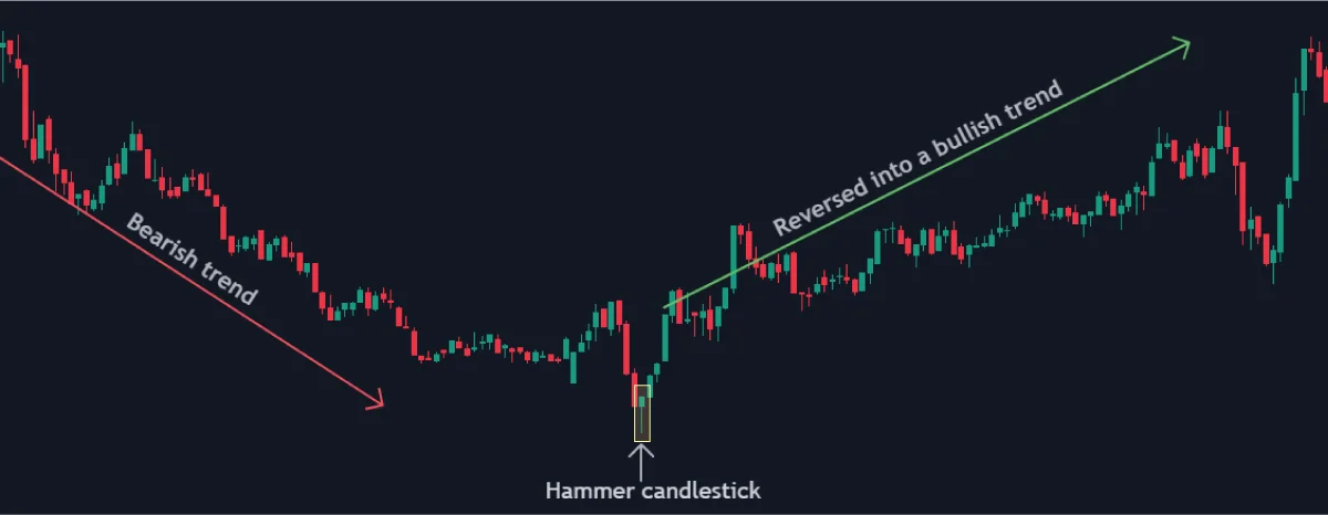
The same logic can also be used in reverse when a bearish to bullish trend reversal is imminent. In this case, it would be a bullish candlestick with a long lower wick, which implies that sellers tried to push the prices lower, but buyers dominated the market. Here’s the perfect example using the Hammer candlestick.
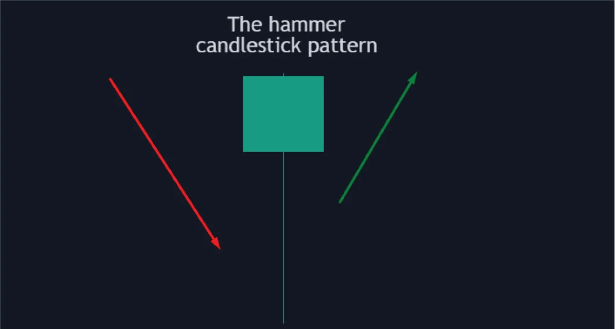
In this example, if the Hammer candlestick appears within a bearish trend, it could imply a possible reversal into a bullish trend, as shown below.
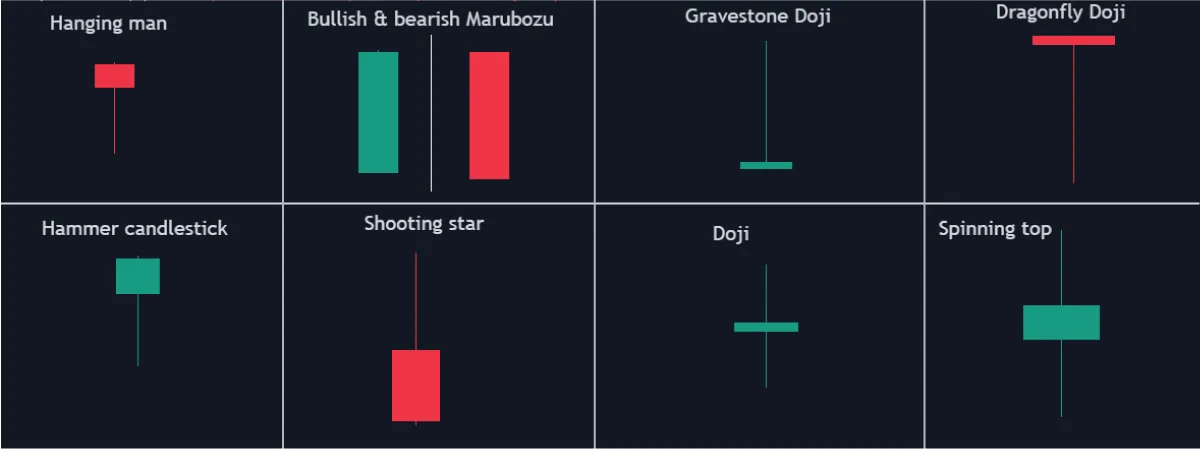
Single Candlestick patterns
The two examples above – the shooting star and the Hammer candlesticks – are categorized as single candlestick patterns. That’s because such patterns are formed when a single type of candlestick appears in a price action. Some common examples of such patterns include the hanging man, the Doji, Marubozu, and the spinning top candlestick patterns.
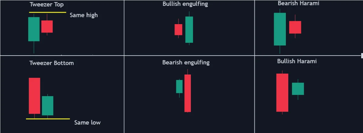
Dual Candlestick Patterns
These candlestick patterns are formed when two candlesticks appear together within a price action. These patterns include the piercing, dark cloud cover, engulfing, tweezer tops and bottoms, Harami, and the on-neck and in-neck candlestick patterns.
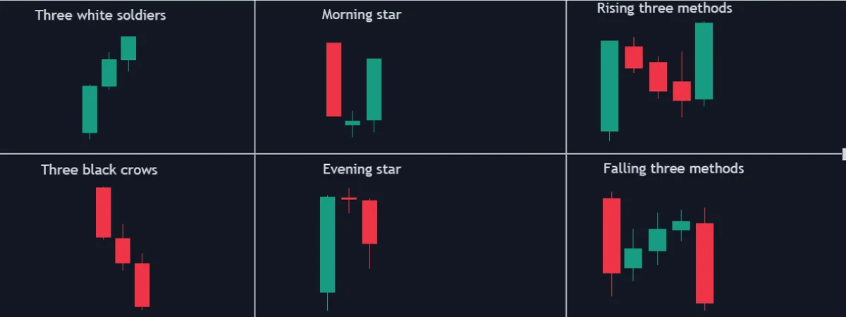
Triple Candlestick Patterns
As the name suggests, these candlestick patterns form when three successive candlesticks appear in a chart. Some of the most common triple candlestick patterns include:
- the morning star,
- the evening star,
- the three black crows,
- the three white soldiers,
- the falling three methods
- the rising three methods
- three inside up and three outside up
- upside Tasuki gap and downside Tasuki gap
- and the Mat Hold candlestick patterns.
Timeframe Analysis: How to Identify Support and Resistance
We mentioned earlier that a price action trader must be able to identify trends and establish potential support and resistance levels for breakout trading. This is where timeframe analysis comes in.
Timeframe analysis in trading simply means observing an asset’s price action over different periods. For example, depending on your trading strategy, you view the chart on 30-minute, two-hour, four-hour, or 12-hour timeframes. This form of technical analysis helps you identify the short, medium, and longer-term overall trend. The logic behind this strategy is to ensure that whichever direction you take in the market is consistent with the overall trend. Or, if you are a contrarian trader, it helps ensure that you are going against the accurate trend.
In price action trading, you ideally use the longer timeframe to identify the prevailing market trend. This allows you to draw longer-term support and resistance zones, ideal for establishing exit levels.
After establishing the longer-term support and resistance, you can then switch to a shorter timeframe to establish shorter-term support and resistance. This allows us to identify the optimal breakout levels for our execution. The best thing about timeframe analysis as a pure price action trading strategy is that it accommodates every type of trader with different risk profiles.
Price Action Trading Strategies
As we’ve shown above with timeframe analysis, trend following and breakout trading are the backbone of price action trading.
The first lesson you may have learned in trading is that history always repeats itself. That means an asset’s price action constantly fluctuates between bullish and bearish trends – the only variable is the scale. You may have a long-term bullish trend that spans an entire week. This means if you were to look at the weekly candle, it’s just one long bullish candle. However, within that weekly trend, several bullish and bearish trends are within the minute, hourly, and daily timeframes.
Price action trading comes down to trend continuation and trend reversals. With that in mind, let’s break down the trend continuation and reversal aspects of price action trading.
Continuation Trading Patterns
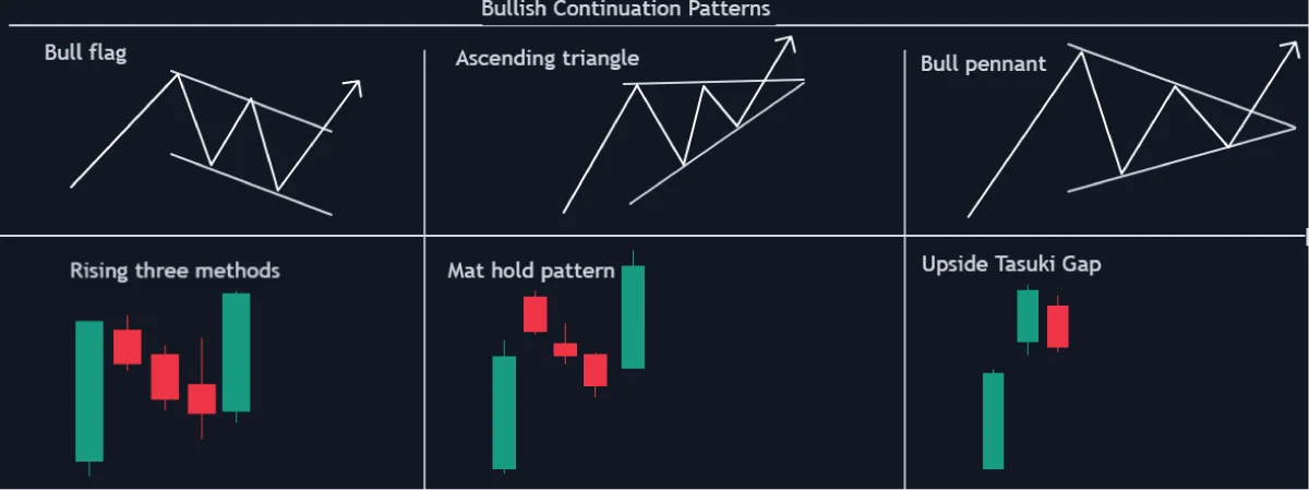
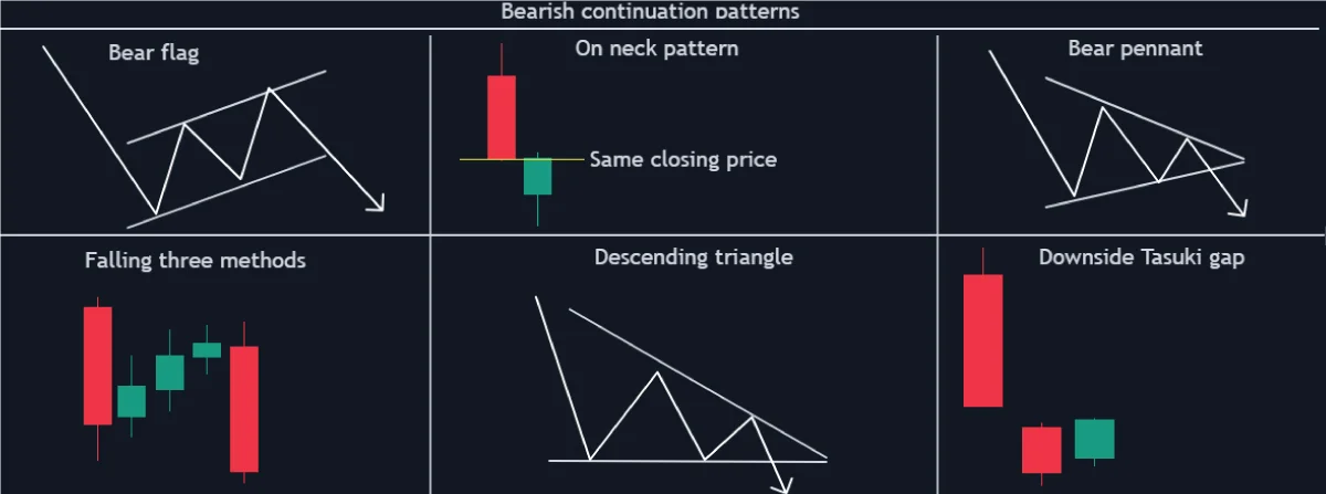
A continuation trading pattern implies that the prevailing trend has undergone a correction phase and is about to resume the previously observed dominant trend. Generally, such trading patterns could be continuation candlestick patterns or chart patterns and either bullish or bearish continuation patterns.
Bullish Continuation Patterns
A bullish continuation pattern shows that a dominant bullish trend has undergone consolidation, and the previously observed bullish trend will continue. Here’s a snapshot of some of the standard bullish continuation charts and candlestick patterns.
Bearish Continuation Patterns
A bearish continuation chart pattern usually occurs when a sustained bearish trend undergoes a correction phase (a slight uptrend or consolidation) and is about to continue in the previously observed downtrend. Here’s a snapshot of some common bearish continuation charts and candlestick patterns.
Reversal Trading Patterns
A reversal trading pattern signifies a potential shift from one trend to the opposite – from bullish to bearish or from bearish to bullish. If a reversal pattern forms in an uptrend, a bearish trend looms. Similarly, a bullish trend could be imminent if such a pattern appeared in a downtrend.
Bullish Reversal Patterns
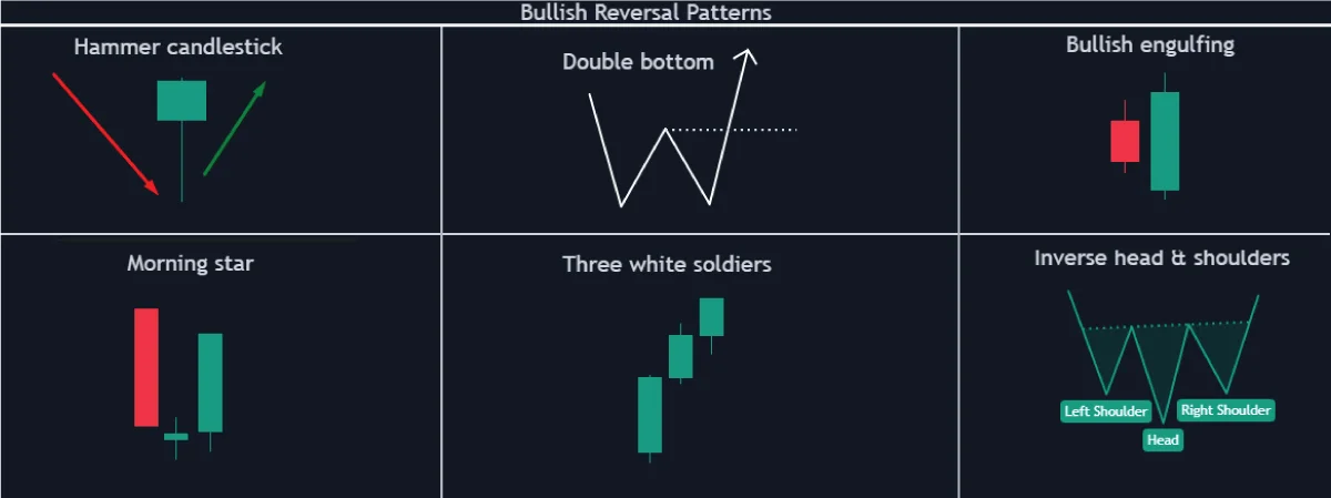
A bullish reversal pattern usually appears in a bear trend. It shows that the current downtrend is weakening and may reverse into a bullish trend. Spotting a bullish reversal could signal to exit your short positions and look for opportunities to go long. These are some of the top bullish reversal candlesticks and chart patterns.
Bearish Reversal Patterns
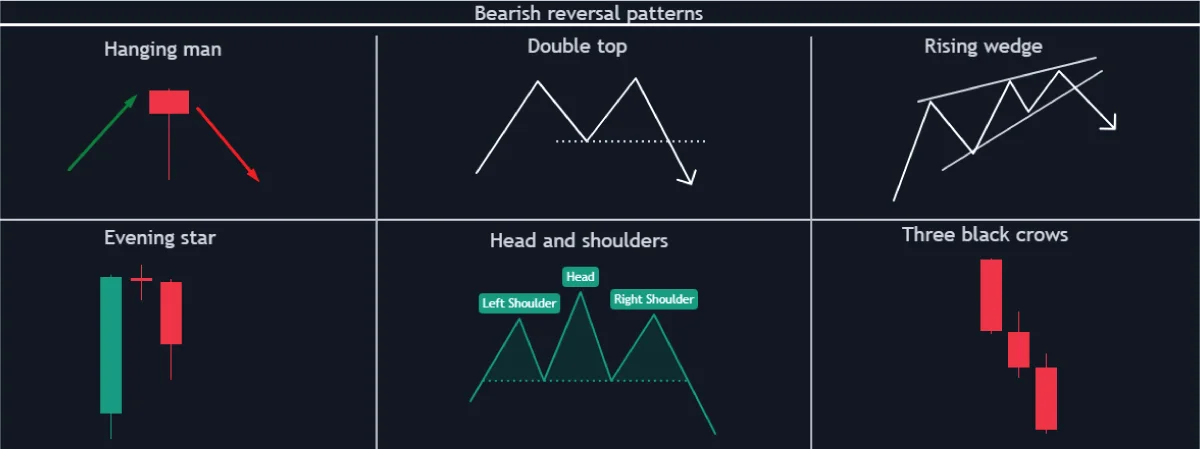
Bearish reversal patterns show a potential price action change from bullish to bearish. Ideally, such patterns form when an asset’s bullish momentum weakens, signifying a probable upcoming bearish trend. The occurrence of such a pattern could be an excellent signal to exit your long positions and look for opportunities to short-sell. Here are some of the most common bearish reversal patterns.
The Bottom Line
If you prefer to avoid populating your trading charts with several indicators that tell you the same thing, then price action trading could be for you. The building blocks of any price action trading strategy involve analyzing candlestick and chart patterns to establish possible trend continuations or reversals. The best part is that these patterns can also help you identify weakening trends, aiding in identifying optimal entries and exits.


